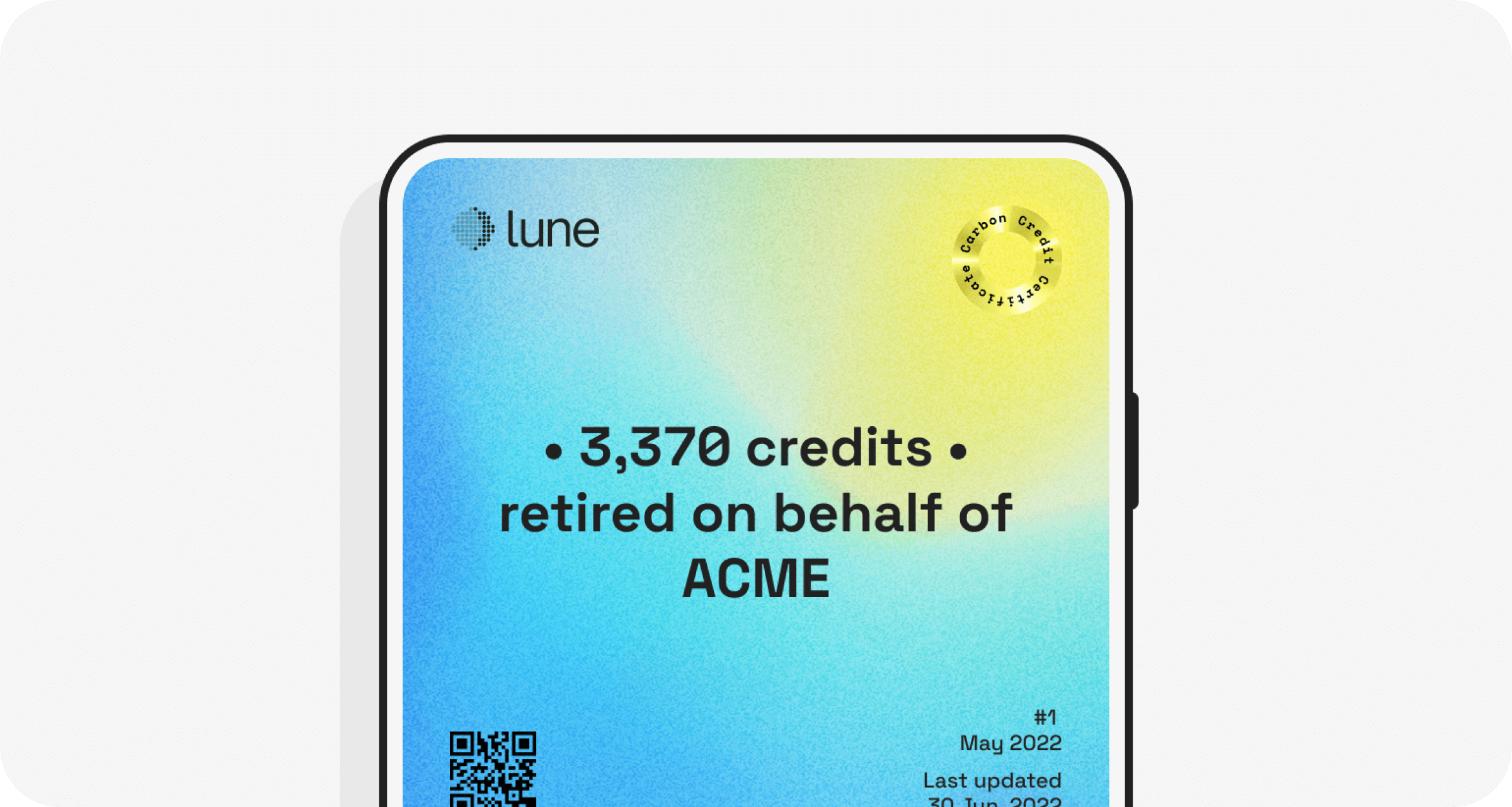

When we sell a carbon credit, we also issue a certificate for you to prove that such credit has been retired on your behalf. This is common practice in the industry, to allow the buyer to track the credit back to the issuer and verifier, and ultimately trust what they’re buying.
What is also common practice is to issue certificates that visually haven’t evolved since the invention of printing – or parchment, sometimes.
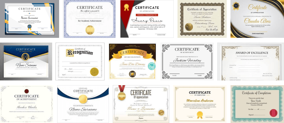
Humour me. Go on Google Images and search for “certificate”. Or I can help you out, this is roughly the images you’ll find there:

Gold, 🖋 blackletter and paper-coloured backgrounds 📜
The images above – and the hundreds more, identical to them – all share a few visual details that are commonly used in designing certificates:
- Gold colour, generally used to mimic a metal coating or render a 3D badge.
- Blackletter, or other classic-looking typographic character styles, including serifs and cursives.
- Paper-coloured background, sometimes grain-textured.
- Ornate frames, often mimicking actual frames, generally adding heavy decoration.
- Horizontal format, never vertical.
- Sealing wax, again mimicking the 3D effect of actual wax.
- Signature, yours truly.
But why are these visual details so common? What are they trying to achieve? Are they necessary or are they a visual legacy we’re carrying over from the 1400s?
Well, a bit of both, let’s unpack it.

🪞 Do you visually trust me?
The majority of the visual elements described above are all trying to achieve the same thing: communicate trustworthiness.
Verba volant, scripta manent. Paper has historically been associated with “legal”, it still is for many key uses ranging from government IDs, to actual printed diplomas.
Blackletters, serifs and cursives are trying to evoke a feeling of old, dated, handwritten or manually printed, not via digital means. Does “old” mean trustworthy?
Gold and sealing wax are similarly evoking old uses of these materials in official contexts. Gold was hard to come by and counterfeit. Sealing wax would similarly carry a hard to counterfeit official seal, as well as guarantee privacy until broken.
Some, like signatures, still have broad application today – and carry their weight. Many are simply relics from the past, including ornate frames, wax, gold, blackletter characters and the horizontal format.
🦄 Unique. 🤝 Guaranteed. 🔐 Hard to counterfeit. 🧵 Traceable.
At Lune we take the trustworthiness of the carbon credits we sell very seriously. There’s no fixing the climate without it.
When we started designing Lune’s Carbon Credit Certificate, we tried to unpack what trustworthiness means in the context of the carbon credits market:
- A certificate should be unique, as unique as the credits it lists.
- It should be guaranteed by Lune, and any 3rd parties involved.
- It should be hard to counterfeit.
- It should be traceable.
✨ Captivating. 💌 Easy to share. 🌖 Branded. 📱 Digital.
We also spoke about how Lune’s Certificate shouldn’t just be something you print and place on your wall (who does that anymore anyway?).
If we are to succeed in offsetting much of the remaining emissions from human activities, we need to make buyers – you – eager and proud to share your contribution towards the climate, and hopefully your customers will notice.
Lune’s Certificate should then also be:
- Captivating, visually attractive, able to stand out in the ocean of content we consume today
- Easy to share, a conversation starter
- Branded, so that Lune can back you up when it comes to quality
- Digital, because who shares paper anymore?
🎁 Tying it all together
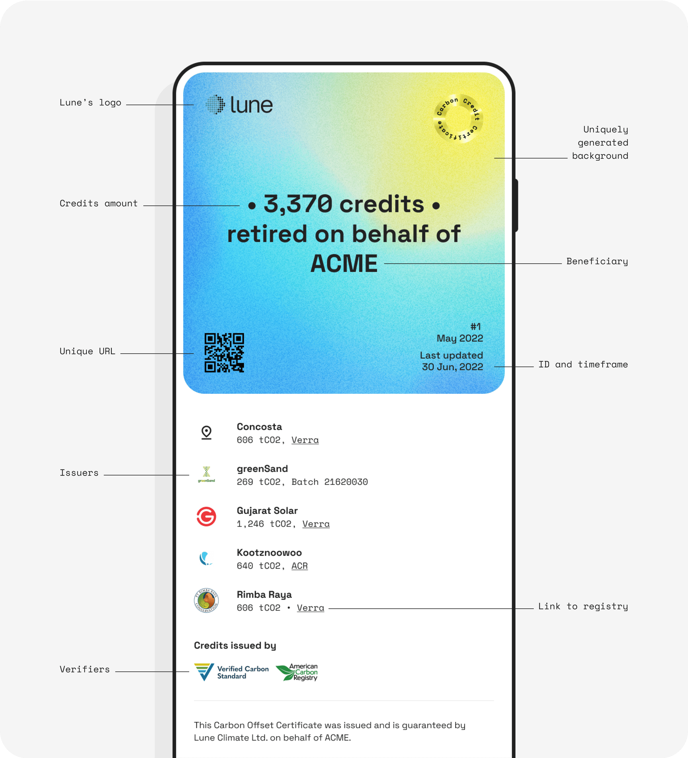
Lune’s Carbon Credit Certificates have a unique ID, a unique URL and a uniquely generated background gradient.
The credits they carry are guaranteed by Lune, guaranteed by Verra, Puro.earth and the other companies verifying the credits, or guaranteed by the companies issuing them in the first place.
Any Certificate you share can be traced back to the original – hosted on Lune’s servers – with its unique QR code. Each credit can be traced back to the issuer and verifier and checked on their registries, via a link or a batch number on Lune’s Certificate.
Its traceability and unique ID make it hard to counterfeit.

The background gradient is uniquely generated using a number of values unique to it (like its issuing date and time), and using them to manipulate the variable parameters that define it (blur, horizontal and vertical complexity, colours).
This ensures variation across Certificates, while restricting the possible colours to a few Lune branded ones, making sure they’re recognisable and visually coherent.
🌍 Yours truly, Lune
We hope you’ll enjoy exploring and sharing your Certificates when you offset with us. We hope they will be able to support you in your sustainability efforts, whether it’s displaying them in an internal stakeholder presentation, or sharing them proudly with your audience.
As anything we do, we’d love to hear your thoughts about this design. Feel free to drop us a line.
Readers also liked
Readers also liked

Subscribe for emissions intelligence insights
Get the latest updates in the world of carbon tracking, accounting, reporting, and offsetting direct to your inbox.


